library(dplyr)library(ggplot2)library(vcd)library(stringr)library(lubridate)library(forcats)library(readr)library(tidyr)library(purrr)library(sf)library(RColorBrewer)library(grid)library(ggalluvial)library(ggridges)library(tigris)library(patchwork)df <-read.csv("Parks_Special_Events_20251027.csv") parks <-read.csv("Parks_Properties_20251209.csv") parks <- parks |>mutate(geometry =st_as_sfc(multipolygon) ) |>st_as_sf(crs =4326)
events_by_month <- df |>count(month, name ="n") |>arrange(month)ggplot(events_by_month, aes(x = month, y = n)) +geom_col() +labs(title ="Number of Events by Month",x ="Month",y ="Number of Events" ) +theme_edav()
Figure 3.1: Monthly Number of Events
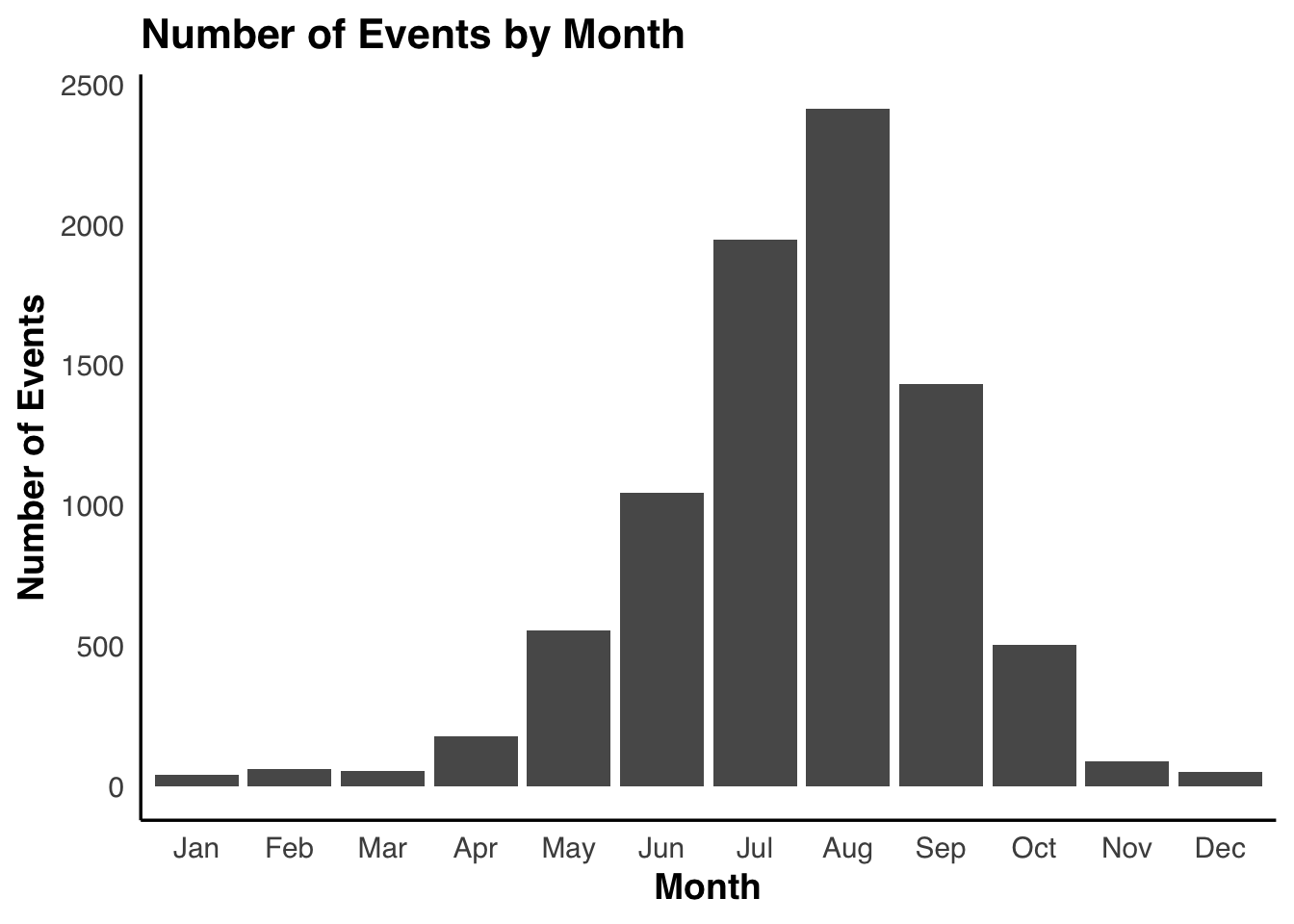
From Figure 3.1 we can clearly see the seasonal pattern of the number of events held in NYC parks. The events are heavily concentrated in late spring and summer, peaking between June and August, Droping sharply during winter. It hightlights the strong dependence of oourdoor public activities on weather and daylight.
Code
top8_cat <- df |>count(Category, sort =TRUE) |>slice_head(n =8) |>pull(Category)df_top <- df |>filter(Category %in% top8_cat)ggplot(df_top, aes(x = doy, y = Category, fill = Category)) +geom_density_ridges(alpha =0.7, scale =1.5) +labs(title ="Seasonal Distribution of Events by Category (Top 8)",x ="Day of Year",y ="Category" ) +theme_edav()
Figure 3.2: Seasonal Distribution for categories
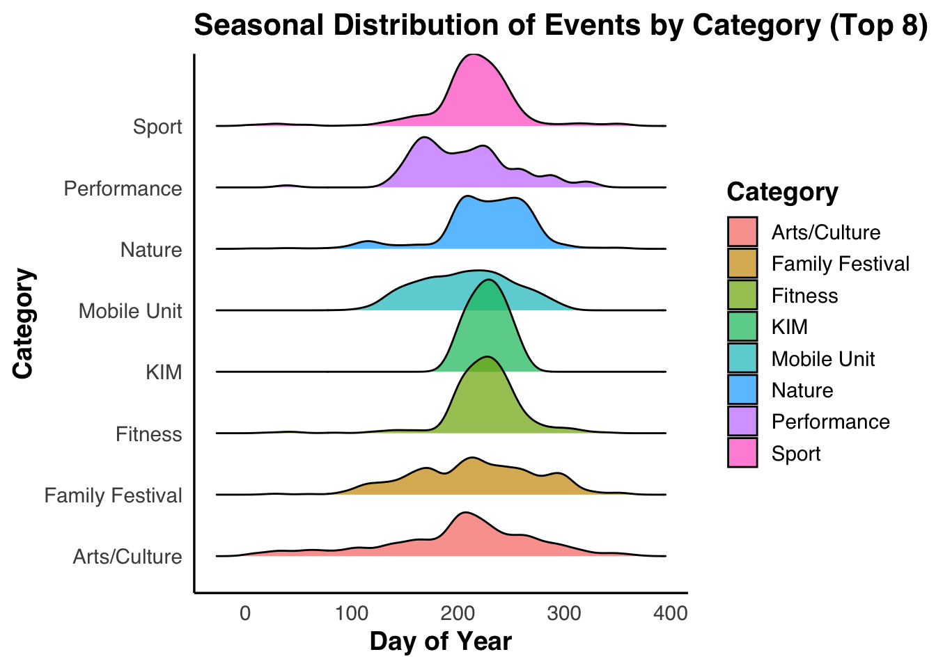
Then we use ridge plot to decompose the overall seasonal pattern into categories. We can see from Figure 3.2 that fitness, sport and KIM related programs show sharply peaked distributions centered around the mid of the year, showing the preference on summer conditions. In contrast, arts and culture as well as family festival events exhibit broader spreads, suggesting greater flexibility. These patterns suggest that the seasonal rhythm of park usage is not uniform, but is structured by the functional nature of events.
Code
df_hex <- df |>filter(!is.na(Attendance_num), !is.na(doy)) |>mutate(Attendance_capped =pmin( Attendance_num,quantile(Attendance_num, 0.99, na.rm =TRUE) ) )ggplot(df_hex, aes(x = doy, y = Attendance_capped)) +geom_hex(bins =20, color =NA) +scale_y_log10() +scale_fill_gradientn(colours =c("#e0f3f8", "#abd9e9", "#74add1", "#4575b4", "#313695"),# trans = "log10",name ="Count") +labs(title ="Attendance vs Day-of-Year",x ="Day of Year",y ="Attendance",fill ="Count" )
Figure 3.3: Hex map for Attendance & Day of year
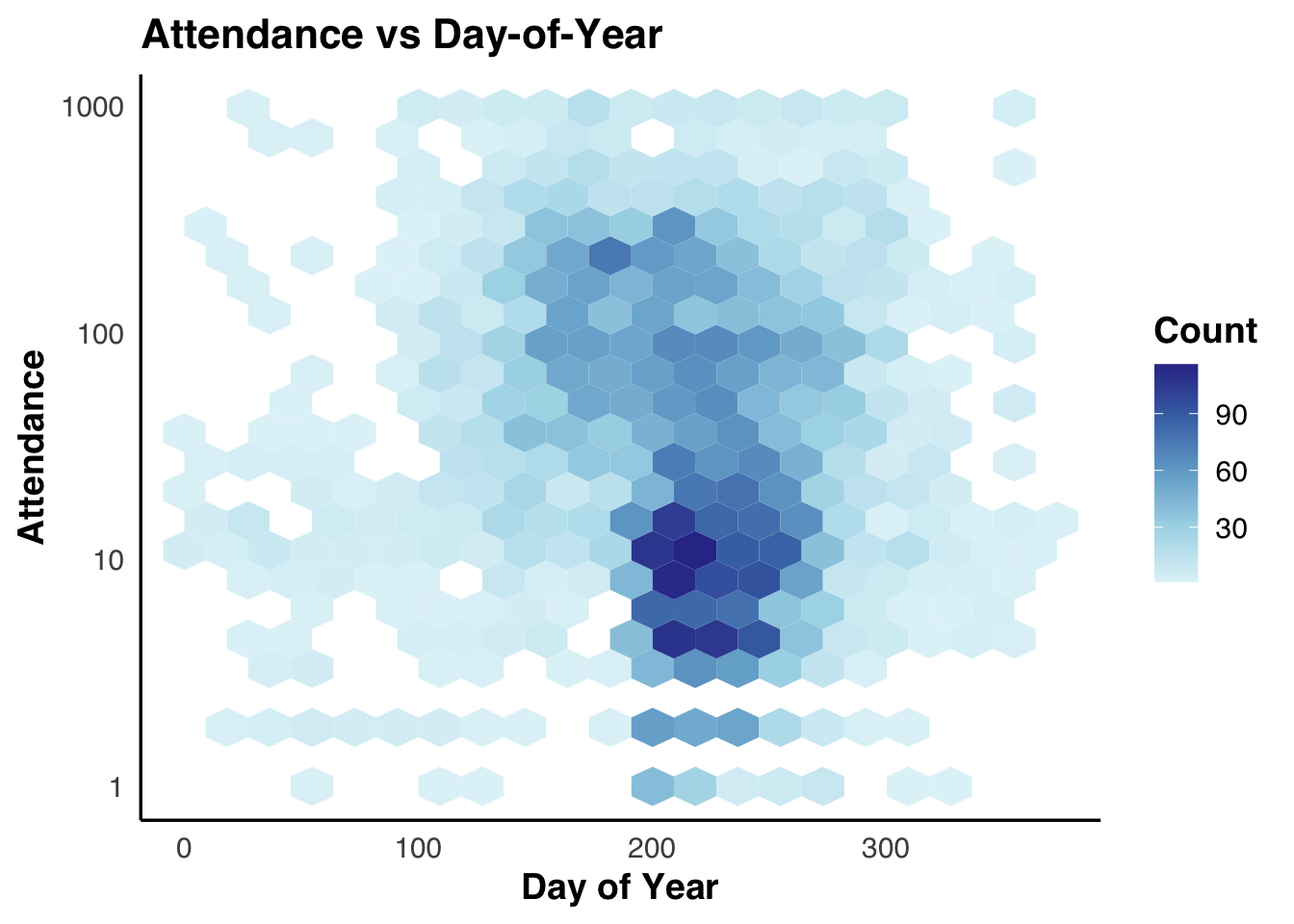
The hexbin heatmap of attendance versus day-of-year(Figure 3.3) shows that the seasonal increase in park activity is driven primarily by a large number of small- to mid-sized events. The highest concentration of events occurs during the summer months with attendance levels between approximately 5 and 20 participants. In contrast, high-attendance events are relatively rare and distributed sparsely across the year.
This pattern suggests that peak park usage reflects frequent, lower-density gatherings rather than occasional large-scale events, highlighting the role of parks as flexible spaces for decentralized public activity.
ggplot( summary_df_year,aes(x = year,stratum = Category,alluvium = Category,y = total_events,fill = Category )) +geom_flow(stat ="alluvium",lode.guidance ="frontback",color ="grey60",alpha =0.8 ) +geom_stratum(width =0.3, color ="grey30") +scale_fill_brewer(palette ="Set2", name ="Category") +labs(title ="NYC Event Categories Over Time",x ="Year",y ="Number of Events" ) +theme_edav()
Figure 3.4: NYC number of events(different categories) over years
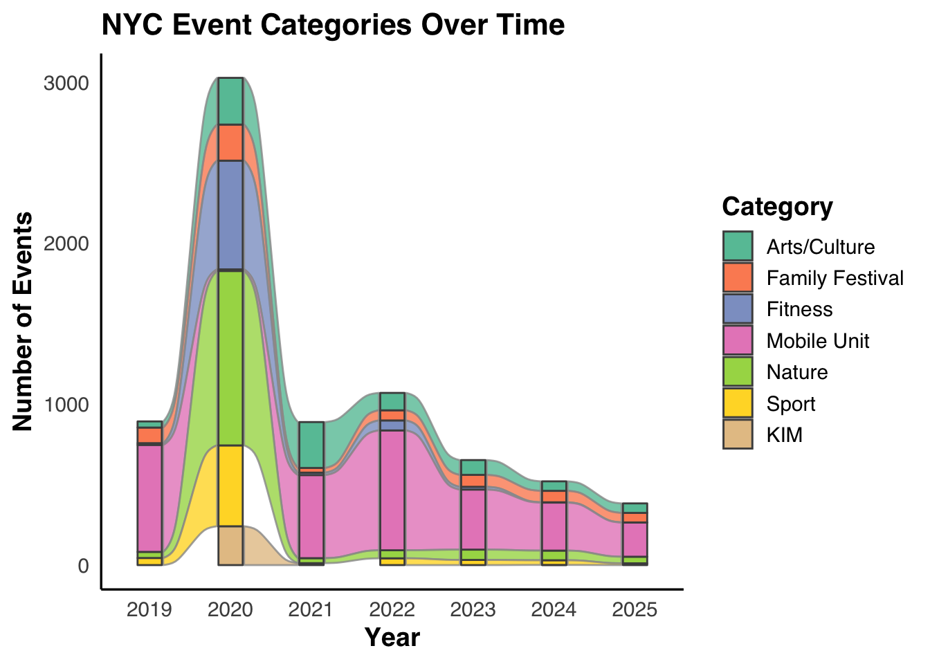
Base on our common knowledge, activities should be effected greatly during the pandemic. But surprisingly, we can see from Figure 3.4 that with the immediate impact of COVID-19 restrictions, the number of events in 2020 is higher compared to the other years. Looking at the poportion over different categories, there’s a huge decrease on the number of Mobile Unit-related events.
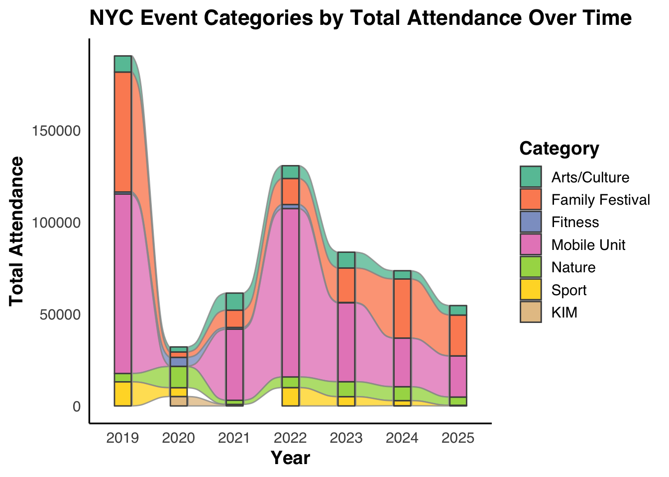
ggplot( summary_df_year_att,aes(x = year,stratum = Category,alluvium = Category,y = total_attendance,fill = Category )) +geom_flow(stat ="alluvium",lode.guidance ="frontback",color ="grey60",alpha =0.8 ) +geom_stratum(width =0.3, color ="grey30") +scale_fill_brewer(palette ="Set2", name ="Category") +labs(title ="NYC Event Categories by Total Attendance Over Time",x ="Year",y ="Total Attendance" ) +theme_edav()
Figure 3.5: NYC attendence for events(different categories) over years
To study the strange pattern in the first alluvial graph, we plot the total attendance instead of number of events(shown in Figure 3.5). When examining total attendance, a different recovery pattern emerges. While event counts is high during pandemics, total attendance is obviously lower than in any other years, particularly for mobile unit and family festival programs. This indicates that those events happened during pandemics is mostly made up of small scale events.
Code
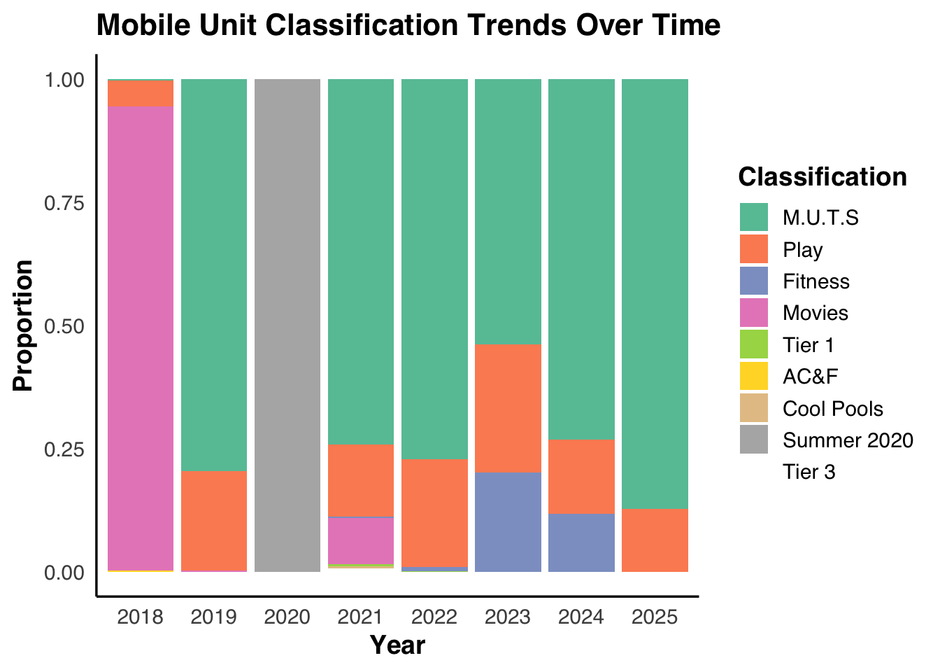
mobile_df <- df |>filter(Category =="Mobile Unit",!is.na(Classification),str_trim(Classification) !="" )top_mobile_class <- mobile_df |>count(Classification, sort =TRUE) |>slice_head(n =10) |>pull(Classification)mobile_year_class <- mobile_df |>filter(Classification %in% top_mobile_class) |>count(year, Classification, name ="n") |>filter(year >=2017) |>mutate(year =factor(year),Classification =fct_infreq(Classification) )ggplot(mobile_year_class,aes(x = year, y = n, fill = Classification)) +geom_col(position ="fill") +scale_fill_brewer(palette ="Set2", name ="Classification") +labs(title ="Mobile Unit Classification Trends Over Time",x ="Year",y ="Proportion",fill ="Classification" ) +theme_edav()
Figure 3.6: Stack Bar Chart showing propotion of classifications for Mobile Unit over time
Since mobile unit is a very important category of the events, and the category name itself doesn’t represent the function, we dive deeper into the detailed calssification to see the patterns.
From Figure 3.6, we can see the proportional composition of mobile unit classifications shows a clear structural shift over time. Prior to the pandemic, mobile units were dominated by movie-related programming, reflecting their role as mobile entertainment platforms. In 2020, this structure collapses into a single, pandemic-specific classification, indicating an emergency-driven reorganization rather than gradual change.
In the post-pandemic period, mobile units increasingly shift toward M.U.T.S, play, and fitness-related functions. This new composition stabilizes after 2022 and does not return to pre-pandemic patterns, suggesting that mobile units evolved from cultural entertainment vehicles into flexible public service infrastructure.
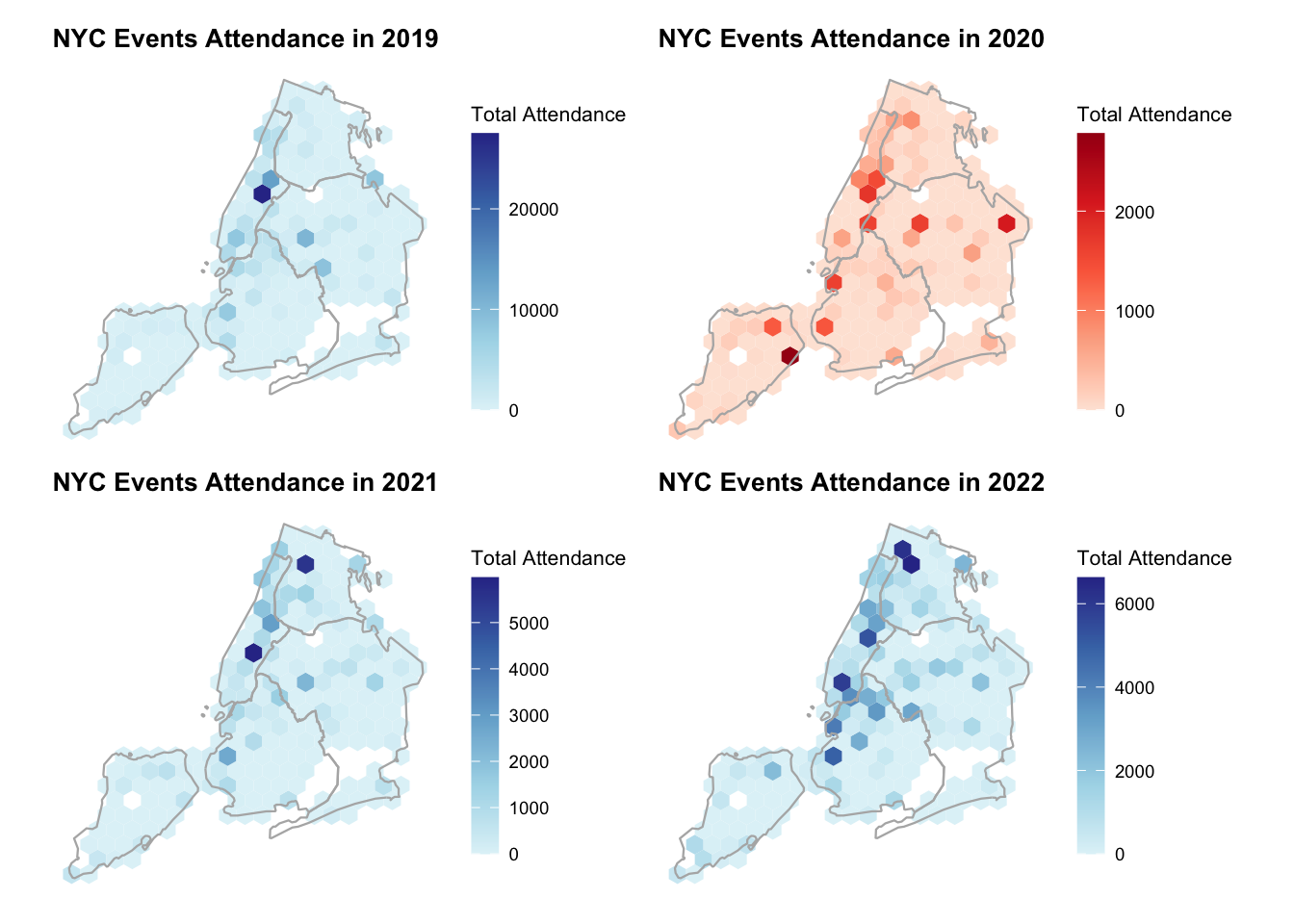
Figure 3.7 shows a clear transformation over time. In 2019, park event participation was highly concentrated in a small number of central locations, reflecting a centralized pattern of public gathering. In 2020, attendance levels dropped sharply and spatial hotspots largely disappeared, resulting in a more uniform distribution across the city.
In 2021 and 2022, attendance gradually recovered, with high-attendance areas re-emerging. However, these hotspots were more spatially distributed than in 2019, suggesting a shift toward a more decentralized pattern of park usage.